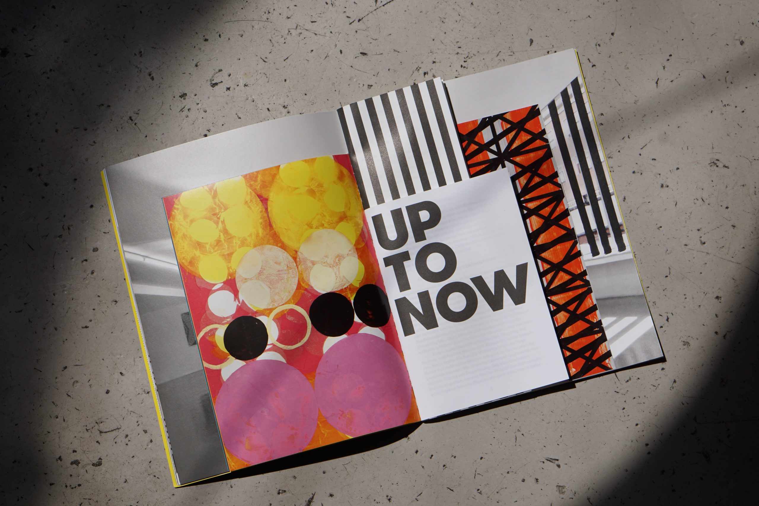
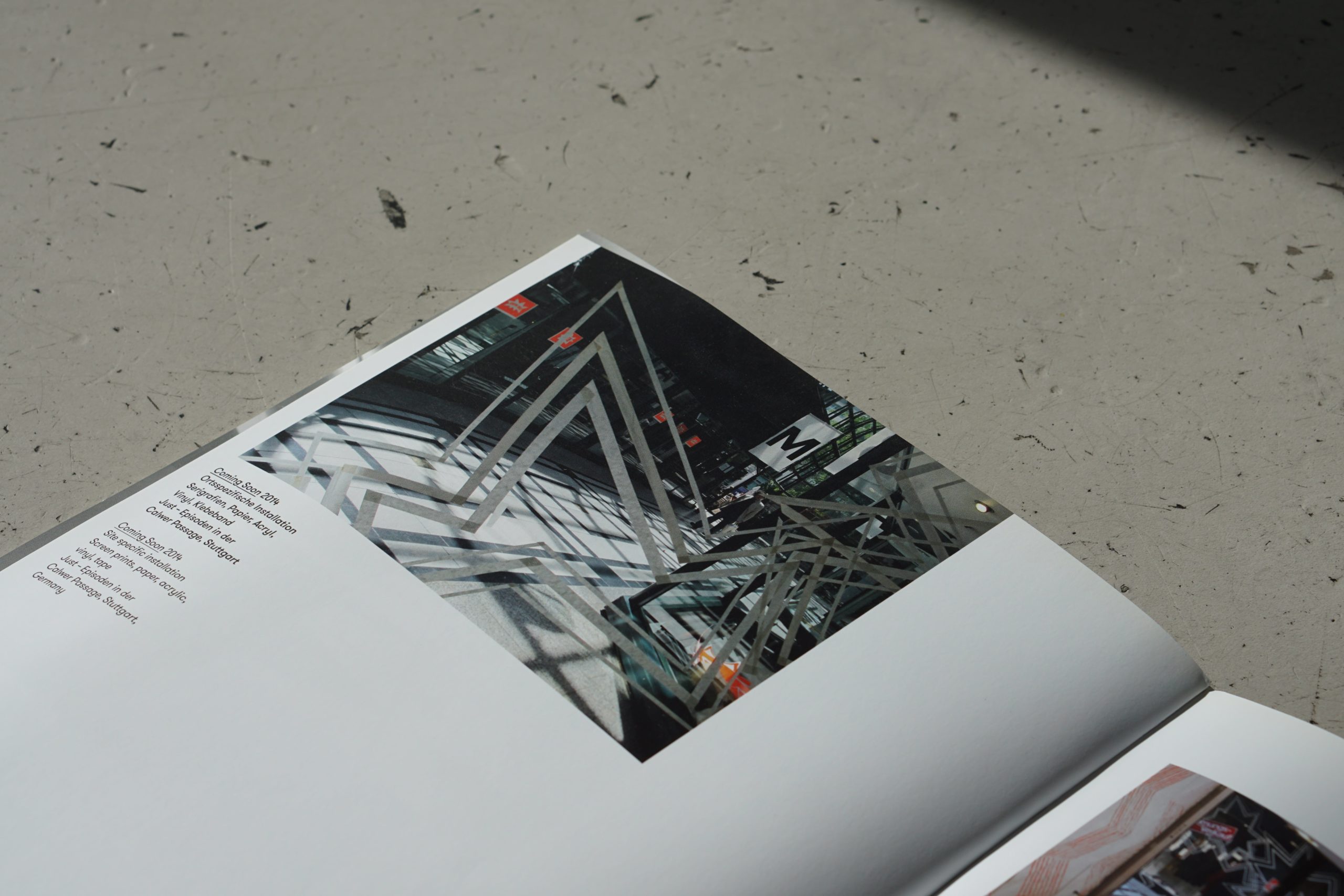
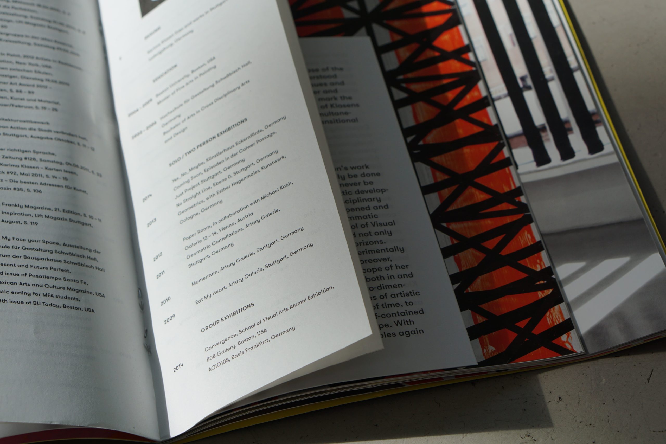
Katja Schloz is a graphic designer and founder of her own studio "Katja Schloz Graphic Design" in Stuttgart. Her works focus especially on typography and are characterized by a distinct clarity and minimalism. After having studied Karima Klasen's work and discovering their common passion for so called "super graphics", the idea for a collaboration was born. In the publication "Up to know" she thematizes Klasen's works in four parts, which differ within the magazine by different paper types and formats, and thereby form a completely new piece of art.
When and how did you get the idea for the book?
The begin of a book project is usually marked by multiple conversations with the artist, and intensely dealing with their art. The ideas usually stem from listening, watching or talking to the artist.
What about the Art by Karima is most fascinating to you?
There are two aspects that are most astonishing to me: creating a walkable graphic, and the apparent resolution of that room by the graphic.
How is your design connected to the works of Karima?
Both of us love “Supergraphics”. Those are big graphics that take over a room.
Who supported you in developing and completing the book?
I discussed the idea with the artist Karima Klasen, and she agreed that it would come together perfectly, since my idea was very fitting for her work, but would still be an independent project. It is very important that the printers and book-binders understand your vision, and have the same standard when it comes to quality.
What are the biggest challenges in making books?
Creating something that hasn’t existed before is the biggest challenge. I like to search for individual or experimental solutions that fit best to the current project.
And how did you master them?
I divided her works in four parts that each use a different kind of paper. Bringing those four parts together in one book was very exciting, because it combines installation, fine arts, graphics and text.
Do you have a favorite double page in the book?
The middle of the book is the highlight, because everything grows stronger and gets more condensed. It is the moment where different kinds of paper and formats come together, almost building an object.
What new print project do you plan to do next?
Recently I started a new series of posters that discuss the theme “Future”. The first graphic called “Now” was created during the Corona shutdown. My plan is to print the series by silk-screen printing, since it makes the colours extra luminous and durable.

Photo: Tom Ziora


